If it ain't broke, don't fix it.
Just a note, the original logo is on the top, and the newer one is on the bottom. All logos are (C) their respective companies.
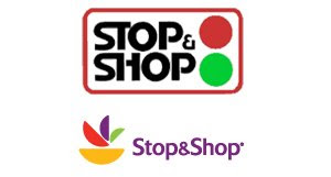 Starting off with the Stop & Shop logo.The original logo was and still is very iconic with this popular grocery store. The red and green "traffic lights" fit the name very well, attract the eye, and has served the company well over the years. By today's standards it may be a little outdated in the text department with the "Star Wars" style "ST" and "SH" and the general shape of the letters do look a bit 70's, but like I said, it is an image that people know and are familiar with. If you wanted to update this logo and still keep it iconic, I would look into changing just the font, something similar, yet more modern looking. However, the designers over at Stop & Shop feel that the way to update an iconic image is to completely start from scratch. With the new purple, yellow, red, and green logo I don't see "Stop" & Shop any more, and I really do not see how the wedges represent a grocery store or the name of the company.
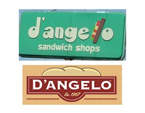 Next up is D'angelo, a popular deli famous for it's grinders.
The original logo was and is very retro 1967, eye catching, and that is what I like about it. I guess the designers at D'angelo though it was time for an update. What they did was, like in the Stop & Shop case, was completely redo the logo and not keep anything about it that makes you recognize the brand. They got rid of the grinder "L" and used one of the most boring type faces around -- Copperplate Gothic set in bold -- and make it look more like a bakery than a deli. I guess this new logo could be fine, maybe throw some imagery of cheese and lettuce under the roll on the top and make it look sandwich like.
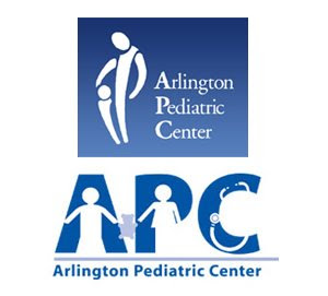 This logo has probably had the rounds in your inbox along with other funny and wrong images.
The original logo for the Arlington Pediatric Center contains an unintentional subliminal message... I understand that it is supposed to be a parent, or a doctor caring for a child, but it doesn't really look that way. I don't think I really need to explain what it looks like here, I hope you all are adults and can add 2 & 2. The serif text next to the icon is appropriate for a medical center, very clean and professional looking. Over all, it is a pretty good logo for a doctor office, they just need to change the image on the left.
I guess they finally looked at the logo again after reading about it all over the net and decided to update it. When I checked the site earlier today they have this new one all over it. While it is more appropriate I sadly feel that it is a down grade. They took a very simple idea and went with it. Now personally, I feel that they did not execute this well. I see where they added "bathroom sign" children holding a teddy bear in the letters to add the visual of a pediatrician, but to me it just seems very cluttered and busy.
 The original Wal-Mart logo has always been simple, bold and noticeable. The new logo is also simple but not as bold. I can sort of see why they changed it... it looks like they are trying to class things up a bit. I'm not sure how well this is going to go over because the classic navy blue logo has become iconic with Wal-Mart's low prices.
On the other side I kind of like the newer logo. It is much more modern looking and follows many of the current trends in graphic and logo design. However, it doesn't carry the same message as the original.
 Starting off with the Stop & Shop logo.The original logo was and still is very iconic with this popular grocery store. The red and green "traffic lights" fit the name very well, attract the eye, and has served the company well over the years. By today's standards it may be a little outdated in the text department with the "Star Wars" style "ST" and "SH" and the general shape of the letters do look a bit 70's, but like I said, it is an image that people know and are familiar with. If you wanted to update this logo and still keep it iconic, I would look into changing just the font, something similar, yet more modern looking. However, the designers over at Stop & Shop feel that the way to update an iconic image is to completely start from scratch. With the new purple, yellow, red, and green logo I don't see "Stop" & Shop any more, and I really do not see how the wedges represent a grocery store or the name of the company.
 Next up is D'angelo, a popular deli famous for it's grinders.
The original logo was and is very retro 1967, eye catching, and that is what I like about it. I guess the designers at D'angelo though it was time for an update. What they did was, like in the Stop & Shop case, was completely redo the logo and not keep anything about it that makes you recognize the brand. They got rid of the grinder "L" and used one of the most boring type faces around -- Copperplate Gothic set in bold -- and make it look more like a bakery than a deli. I guess this new logo could be fine, maybe throw some imagery of cheese and lettuce under the roll on the top and make it look sandwich like.
 This logo has probably had the rounds in your inbox along with other funny and wrong images.
The original logo for the Arlington Pediatric Center contains an unintentional subliminal message... I understand that it is supposed to be a parent, or a doctor caring for a child, but it doesn't really look that way. I don't think I really need to explain what it looks like here, I hope you all are adults and can add 2 & 2. The serif text next to the icon is appropriate for a medical center, very clean and professional looking. Over all, it is a pretty good logo for a doctor office, they just need to change the image on the left.
I guess they finally looked at the logo again after reading about it all over the net and decided to update it. When I checked the site earlier today they have this new one all over it. While it is more appropriate I sadly feel that it is a down grade. They took a very simple idea and went with it. Now personally, I feel that they did not execute this well. I see where they added "bathroom sign" children holding a teddy bear in the letters to add the visual of a pediatrician, but to me it just seems very cluttered and busy.
 The original Wal-Mart logo has always been simple, bold and noticeable. The new logo is also simple but not as bold. I can sort of see why they changed it... it looks like they are trying to class things up a bit. I'm not sure how well this is going to go over because the classic navy blue logo has become iconic with Wal-Mart's low prices.
On the other side I kind of like the newer logo. It is much more modern looking and follows many of the current trends in graphic and logo design. However, it doesn't carry the same message as the original.
Labels: logo
posted by David F. at
12:46 AM
2 Comments


